Problem
The BC Children's Hospital (BCCH) struggle with navigation across their 1M+ square foot campus, leading to confusion, stress, appointment delays, and clinic disruptions due to varied signage and numerous facilities.
Solution
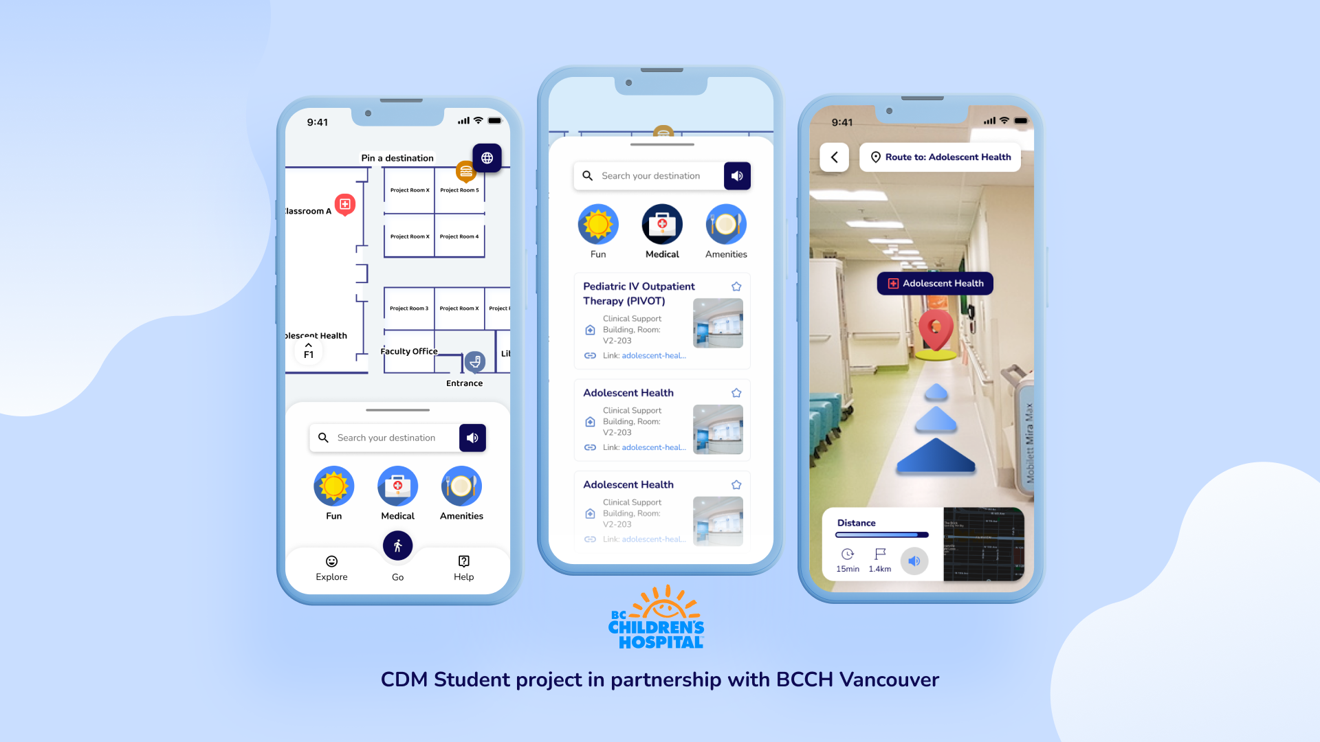
Our team, 6-Bit Studios, developed an AR navigation app MVP for BCCH, targeting parents, children, and youth, with a focus on accessibility to improve navigation, reduce stress, and prevent appointment delays.
Duration:
12 weeks
May - Aug 2024
May - Aug 2024
Tools:
Figma, Miro, Procreate
My Role:
• UX Research and Design with a focus on accessibility
• User interviews and testing
• UI Design; elements, design system, style guide
• 2D concept art
• UI Design; elements, design system, style guide
• 2D concept art
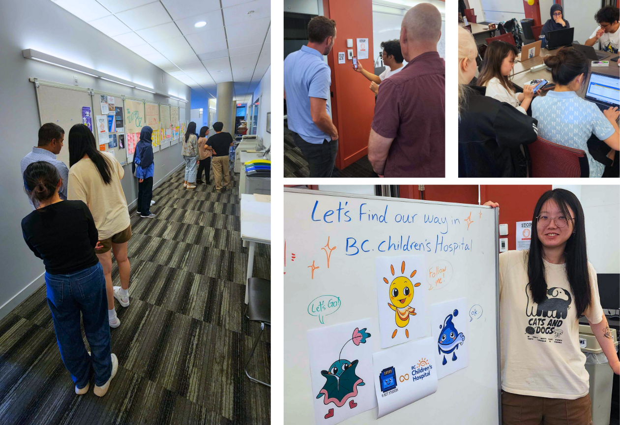
RESEARCH
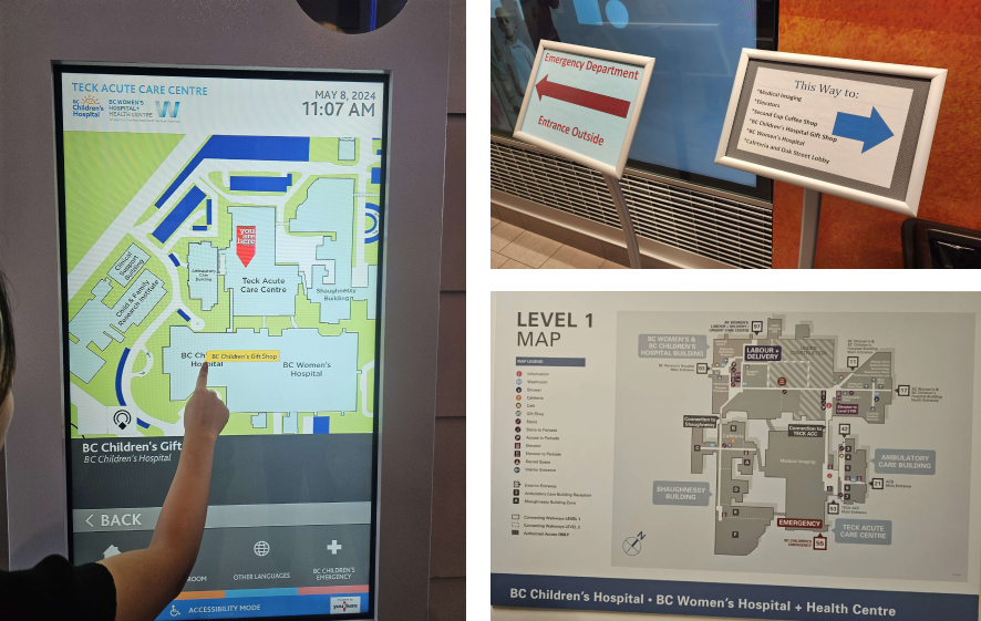
On-Site Research at BCCH
Kiosks and 2D physical maps were not very user-friendly and challenging to decipher, especially in regards of accessibility and did not display information clearly.
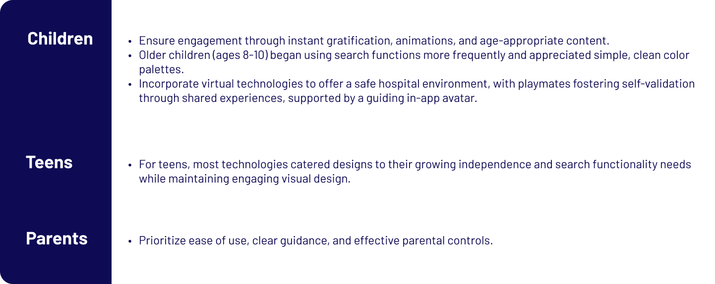
Secondary Research - Key Insights
• Engaged in continuous primary research via user tests, focusing on interface and navigation usability.
• Informed secondary research on users, accessibility, UX/UI, technology, and art.
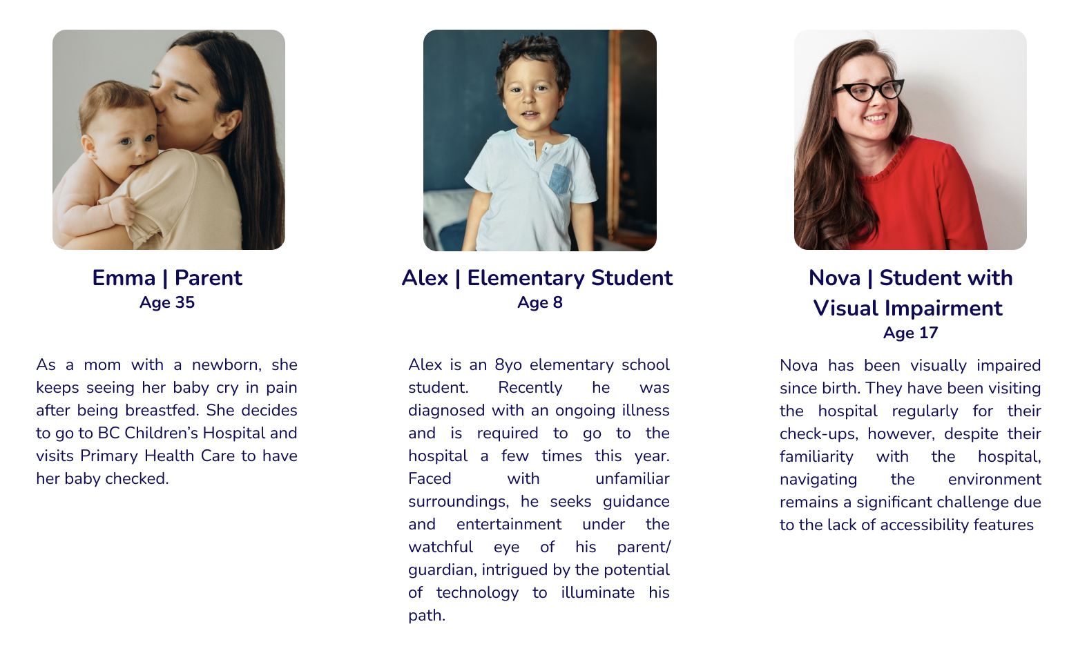
• Explored the needs of three user groups: children, teens, and parents.
• Aimed to create a seamless and enhanced user experience in a stressful hospital environment.
• Informed secondary research on users, accessibility, UX/UI, technology, and art.
• Explored the needs of three user groups: children, teens, and parents.
• Aimed to create a seamless and enhanced user experience in a stressful hospital environment.
User Stories
These insights led us to create user stories to inform important features
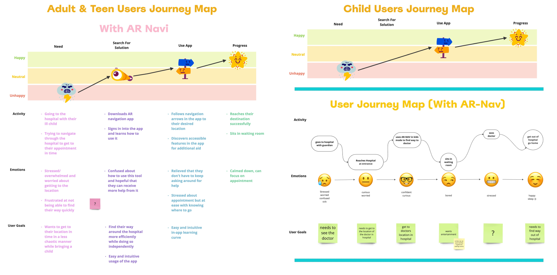
User Journey Map - 2 User Groups
Emotional Journey:
• Adults & Teens: Start stressed about navigating the hospital with their child. Using AR Navi reduces confusion, but stress persists until they reach their destination.
• Children: Begin anxious and sick. Using the app increases confidence but doesn’t fully address boredom or stress during the visit.
User Goals:
• Adults & Teens: Want to reach their appointment on time with less stress and independently navigate the hospital.
• Children: Need to see the doctor and avoid boredom during the hospital visit
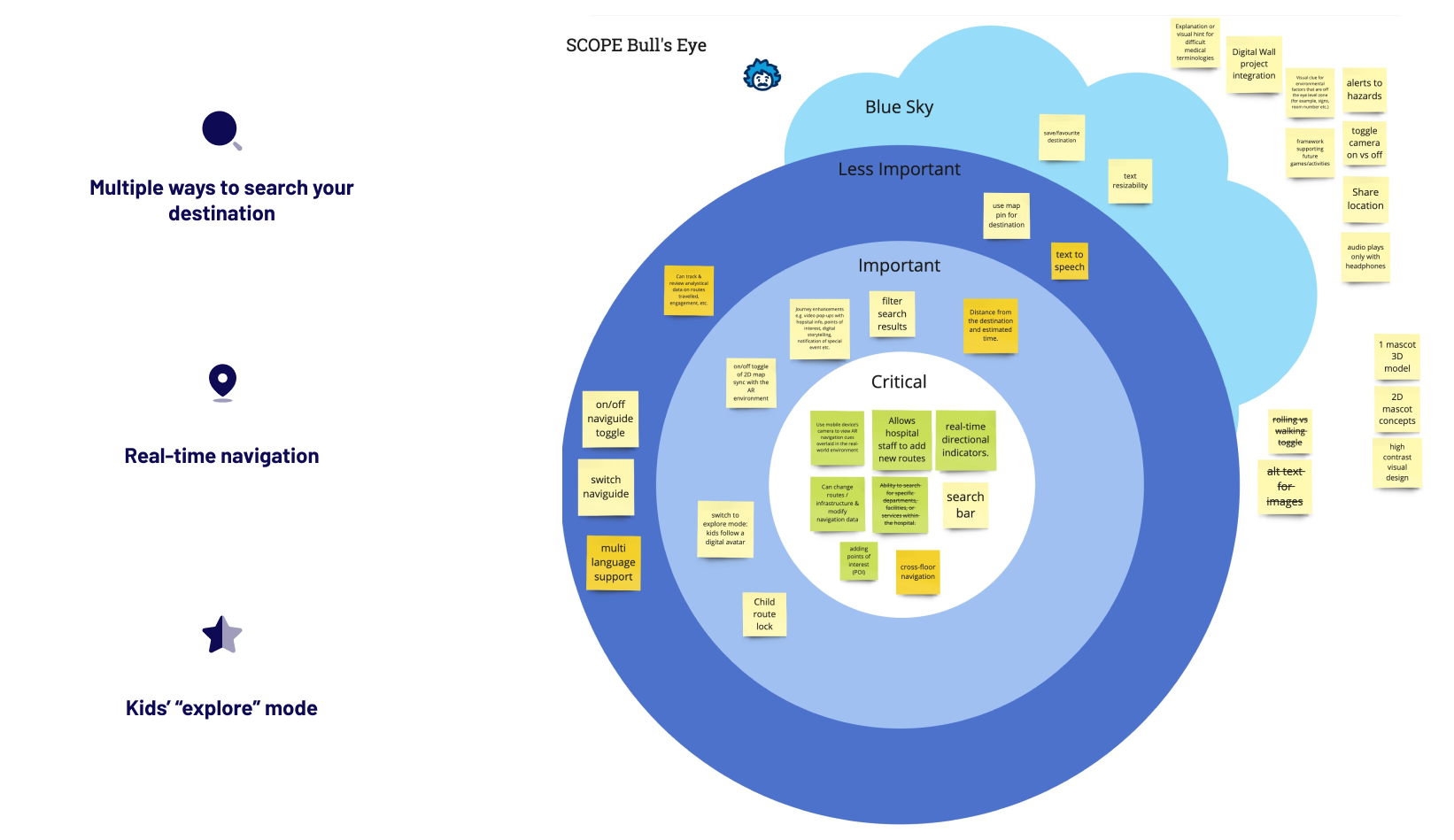
Bull's Eye - Features
Our team conducted a Bull's-Eye exercise to determine our scope and prioritize key features to work on. This was very effective for our workflow and collaborative design process as we were able to refer to this board for tasks to complete in order.
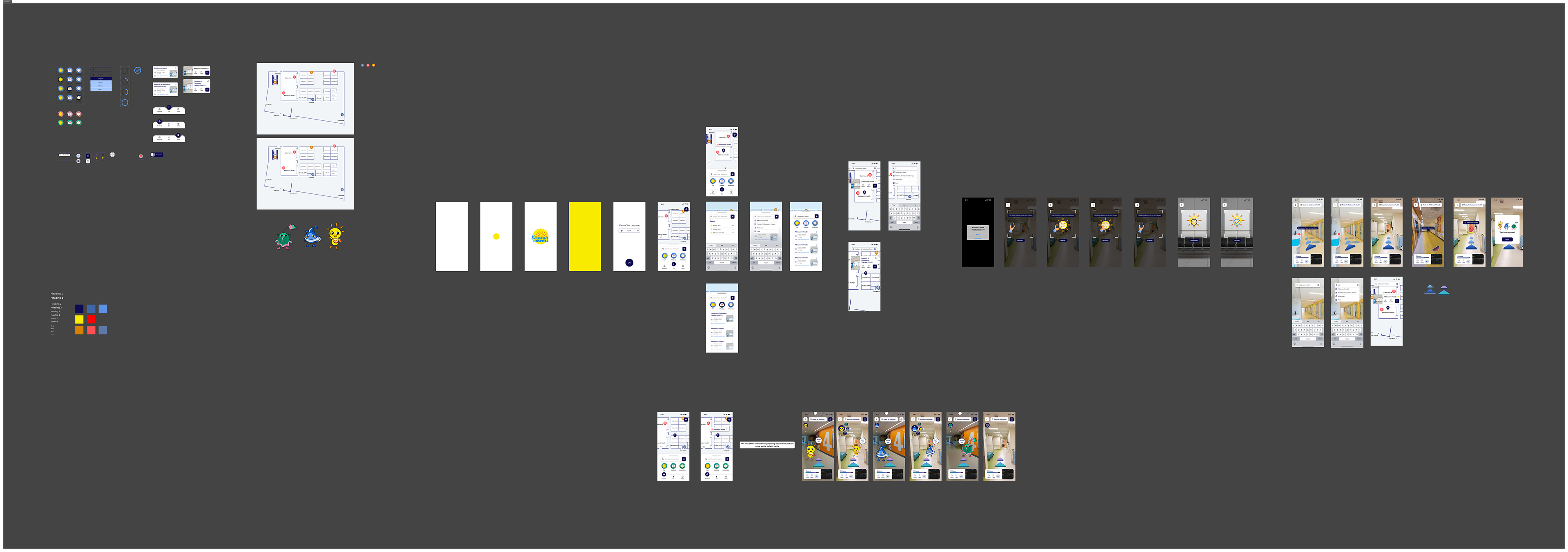
WIREFRAMES
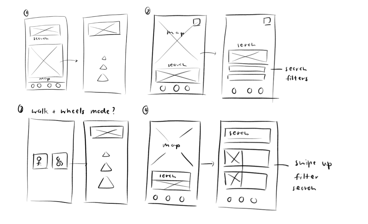
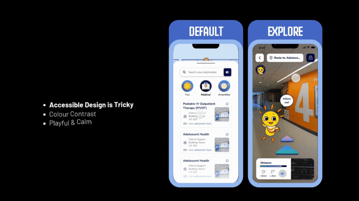
Home Screen
• I created wireframes to map out the app's layout and prioritize the 3 important features
• Ensured app usability by identifying the quickest and most intuitive ways for users to search for destinations.
• Focused primarily on designing the UI and improving accessibility.
• However we faced challenges in identifying the most familiar layout for target users.
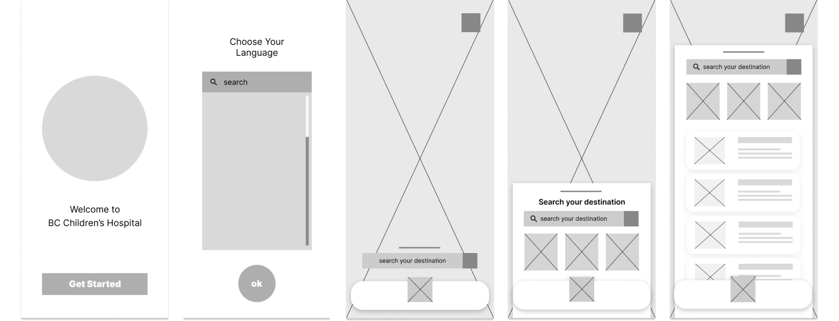
• The team conducted a user test on the initial wireframe.
• Tested placement of the search bar (top vs. bottom).
• Key insight: users preferred the search bar at the bottom, near their thumb.
• Bottom placement allowed users to quickly type their destination.
• This preference aligns with modern design trends.
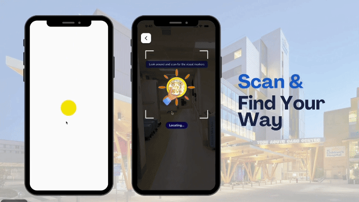
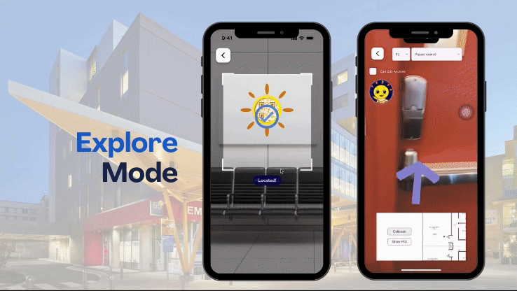
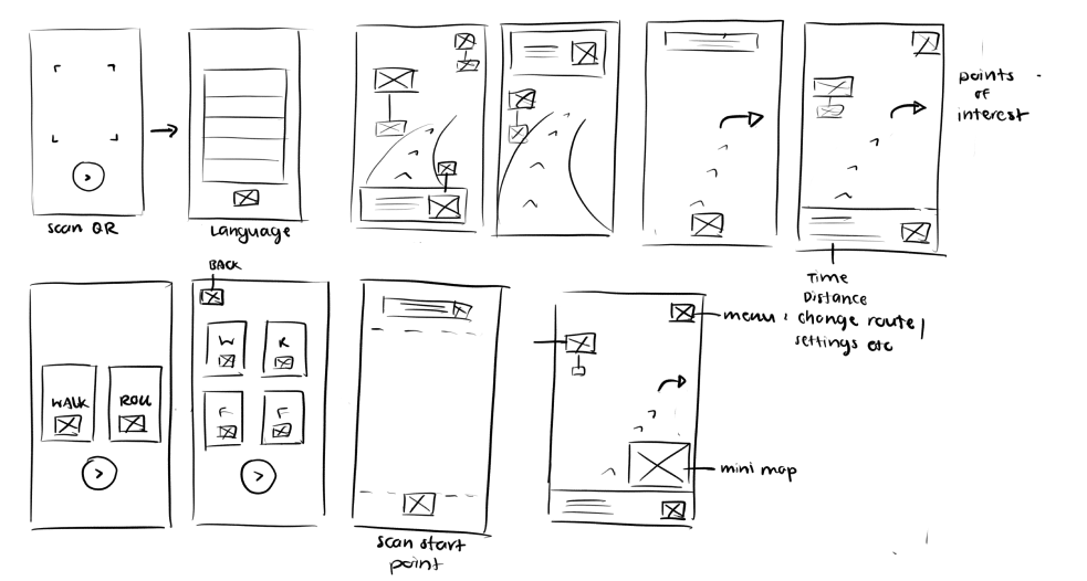
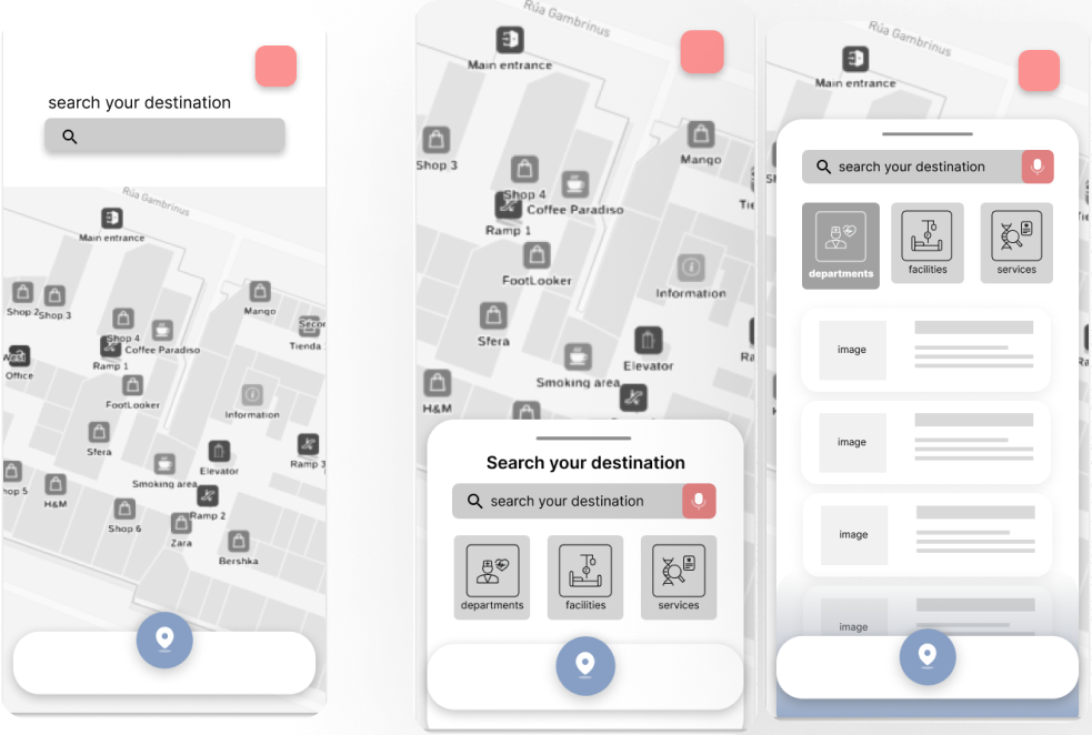
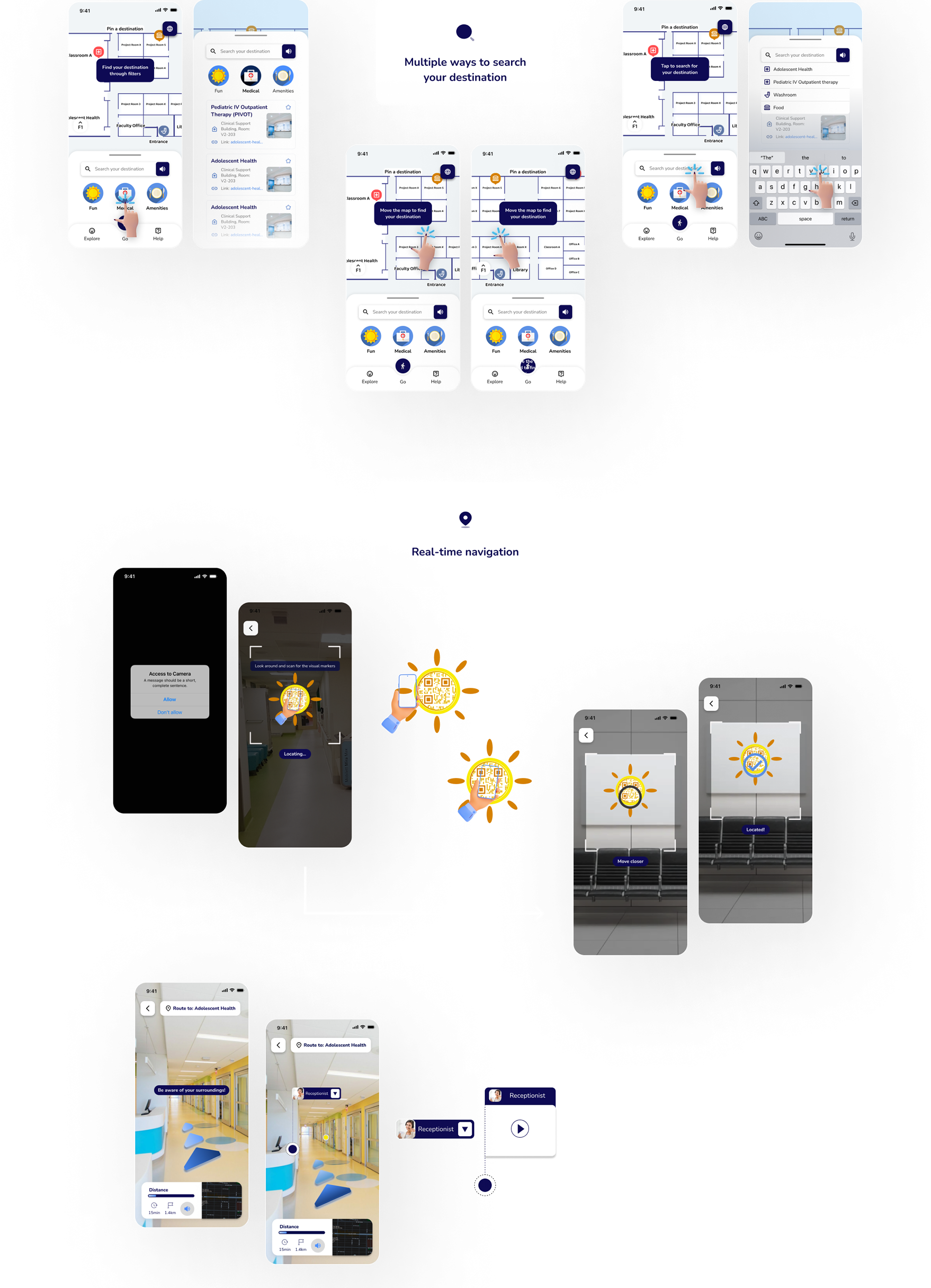
AR Screen
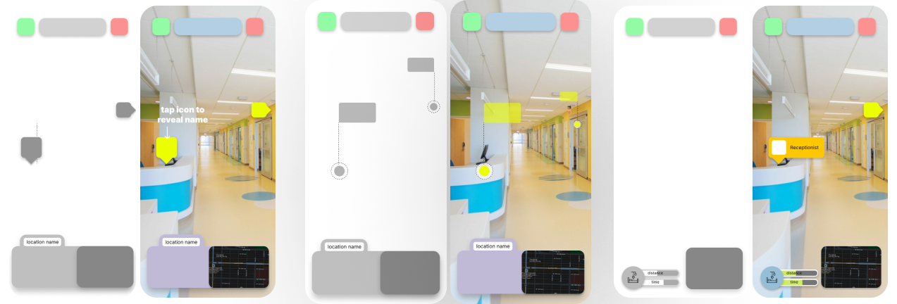
• Challenge: determining the most effective AR navigation screen.
• Screen required points of interest indicators and clickable pop-ups for hospital information.
User Testing
• This is my first time working with AR, so I went through extensive learning and running user tests.
• User feedback: preferred the middle design.
• Middle design was clean, uncluttered, and functional.
VISUAL DESIGN
Accessibility Colour Research
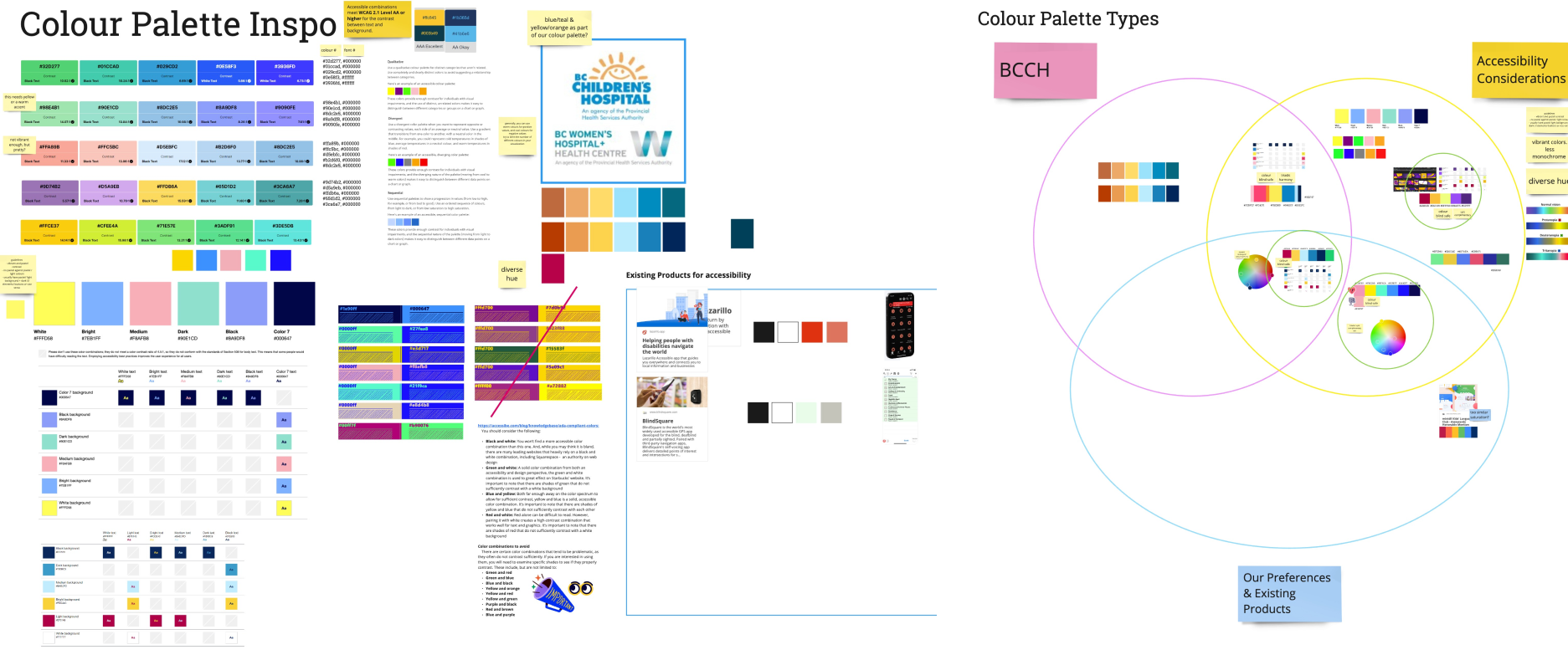
Our accessibility research combined user, UX/UI, and technical insights, focusing on current standards, guidelines, and built-in mobile accessibility features. We observed that most accessibility designs prioritize visual impairments, leading us to concentrate on high contrast designs. To ensure compliance, we used tools like A11Y. Given our time limitations, this was the extent of our accessibility efforts, though balancing aesthetics with accessibility presented significant challenges
Implementing visual design in the prototype for user testing
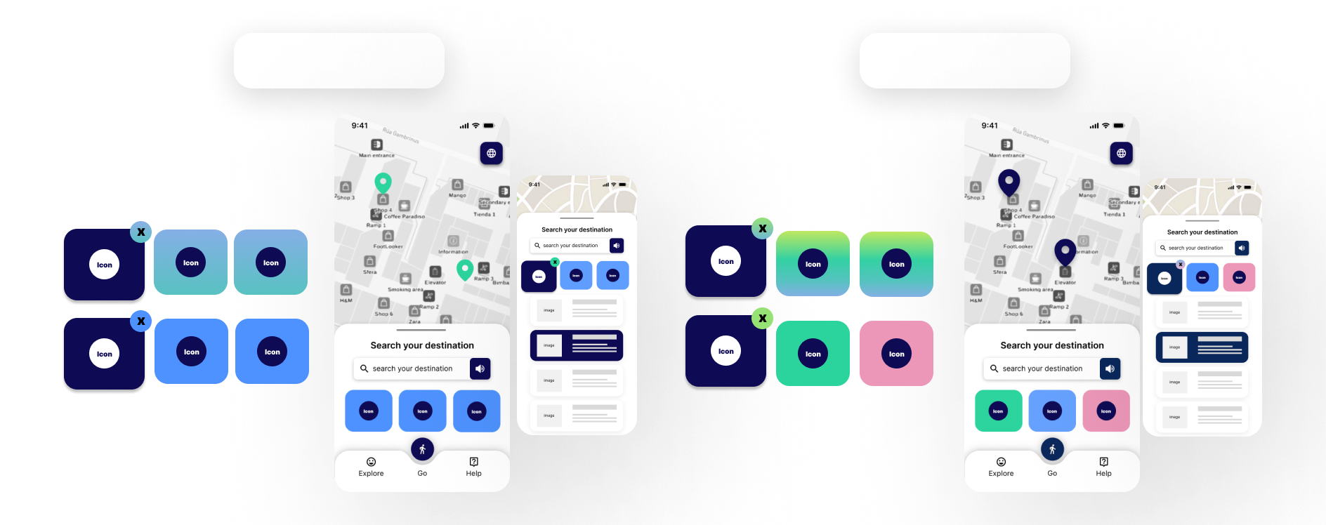
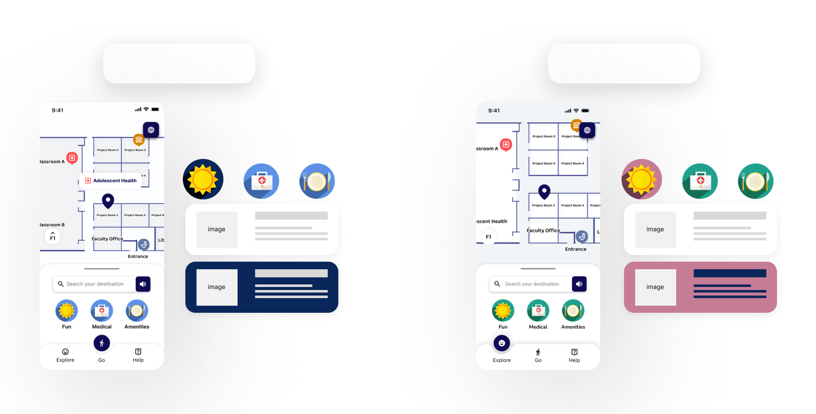
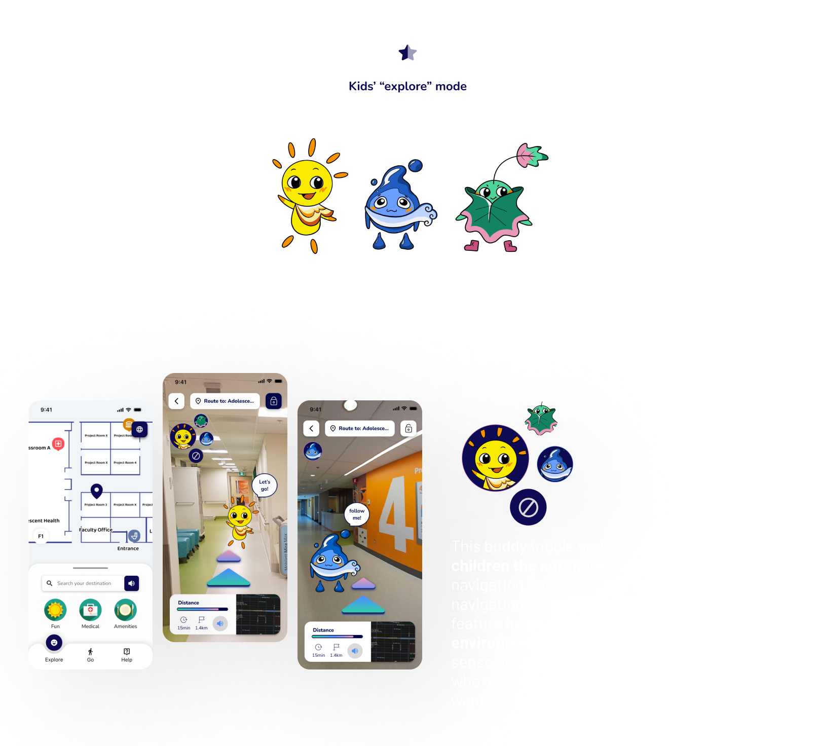
The default color palette is designed to be neutral and calming, suitable for a healthcare app while also incorporating lively tones appealing to both caretakers and youth.
The explore mode incorporates teal and pink to infuse liveliness. These colours meet accessibility contrast standards while maintaining visual appeal.
Iconography
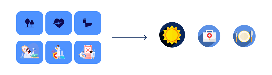
During the iconography design phase, our team discussed making the icons more distinctive instead of using a flat design of navy blue. Balancing accessibility, aesthetics, and functionality was challenging. Ultimately, we chose to deviate from our user test results favoring flat icons and buttons, opting for a hybrid approach that combines simplicity and complexity while still considering accessibility needs.
AR Navigation
These colours influenced the rest of our designs for the main AR navigation screen. Determining arrow colors that would stand out in the hospital environment, meet accessibility standards, and remain visually appealing was challenging. After multiple iterations and extensive client discussions, we finally achieved a balanced solution.
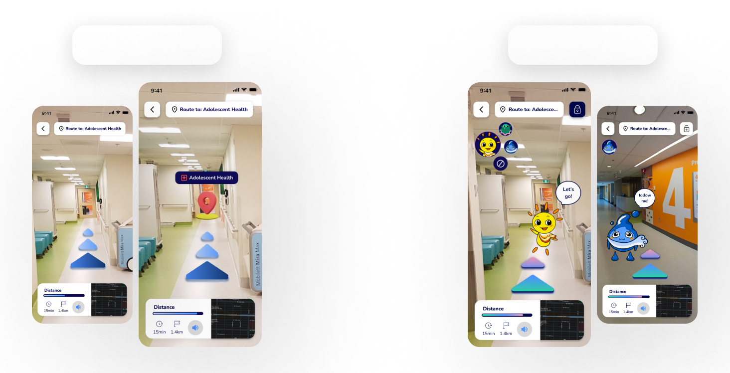
Arrow colours are mode-dependent; balancing accessibility considerations and visual aesthetics.
FINAL DELIVERABLES
Through continuous prototyping, testing, and iterations, we developed the final version for our client handoff. We implemented a design system and provided editable files, ensuring the client team can easily modify assets in the future.
Design System
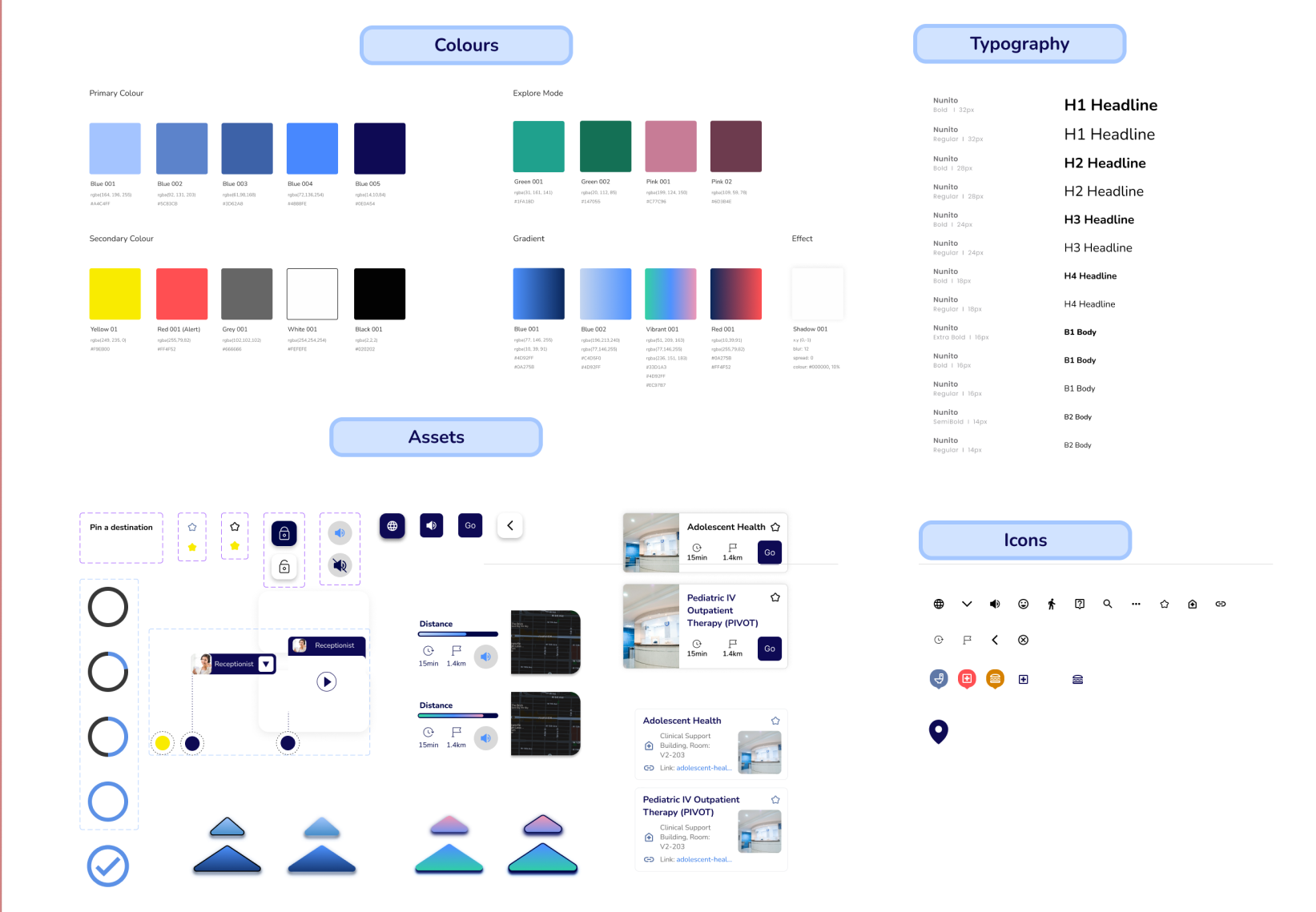
Features
TAKEAWAYS
• First AR project and healthcare field experience was very challenging.
• Numerous UX/UI considerations, including designing for children and parents.
• Prioritized accessibility throughout the design process.
• Learned extensively about designing for visually impaired individuals.
• Balanced visual aesthetics with functionality.
• Improved technical skills in Figma.
• Gained valuable experience in: Client communication, negotiating and pitching ideas, and benefiting the product and target users.